Navigating Portals on Mobile Devices
Header Bar and Menu
websites have a header containing various links and, on some pages, a search form.

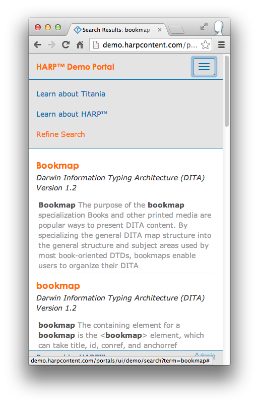
However, on smaller screens, this would take up too much horizontal space. To save that space, moves the links and the header to a menu box once the screen becomes too small.

Table of Contents
When viewing a DITA topic through a Portal, the table of contents for the current publication appears on the left with the current location highlighted.
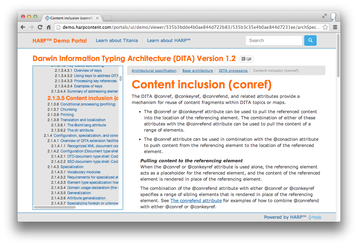
Once again, that would take up too much space on a smaller screen, so the table of contents is not visible. However, a Table of Contents link will appear in the header menu allowing you to switch back and forth between the content of the current topic and the table of contents (seen above).
Refining Searches
The Search Results page has a form allowing users to perform another search or to refine the current search using Search Facets, if any are configured.
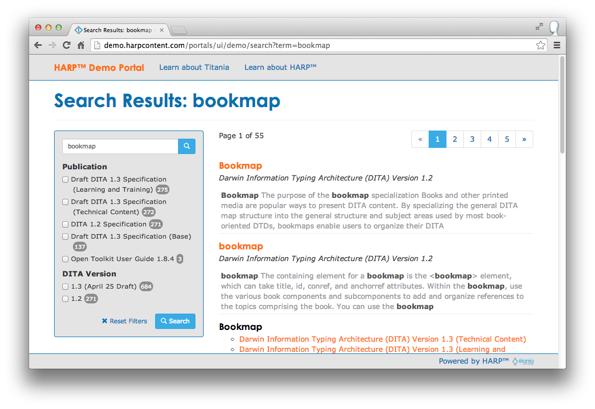
This would take up too much space on a small mobile screen. Just like the table of contents on the topic viewing page, though, there is a link labelled Refine Search available on the heading menu that will allow users to toggle back and forth between the search results and the search form.
QR Codes
Almost every page in a Portal has, or can have, a QR Code associated with it. By default, many pages contain a link to that page's QR Code right at the top of the page. Users can use these QR Codes to quickly and easy load Portal pages on mobile devices. QR Codes can also be printed for referral to a Portal from a physical location. For example, a manufacturer may put the QR Code for service documentation directly on the equipment itself.